Remodel, or move? It’s a common conundrum. When Betsey and Brian Matsubara realized the space, style, and location of their mid-century home in Seattle’s Magnolia neighborhood was going to be tough to replicate anywhere else, they decided to skip the moving van and hire a design and contracting team instead.
“We had never remodeled before,” says Betsey. “We’d never worked with designers or contractors. We’d never done anything at this scale. But I had a ton of ideas and no idea where to go with them. I needed somebody with the expertise to guide us.”
That somebody turned out to be Alex Childs and Brooke Prince, principal designers at White Space Design Group, a Seattle-based design firm specializing in residential and small commercial projects. Together, they developed a plan for transforming the Matsubara’s beloved but dated home into a bright, open, contemporary retreat that would work better for their busy family.
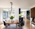
From a structural perspective, the most important part of the remodel involved removing extra interior walls to improve flow and movement within the home, especially between the kitchen and the dining room. “One of the most common misconceptions about 1950s mid-century homes is the idea that it’s all open, connected space,” says Alex. “But the trend was still to compartmentalize the kitchen instead of including it as part of the entertaining space. At the Matsubaras, there was a narrow doorway connecting the kitchen to the dining room, and then another doorway leading to a stair. It was a really tight space that created a bottleneck for congestion.”
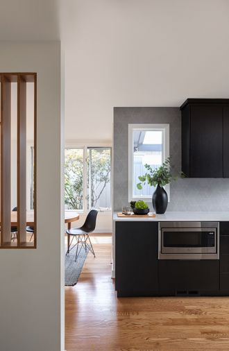
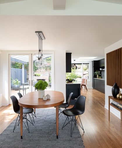
By removing those walls, White Space Design Group was able to not only relieve the pinch point but also extend sightlines throughout the kitchen and dining room, making the space feel larger and revealing more views and better light. “It completely changed the way they were able to use the space,” she says.
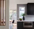
Another architectural update was rethinking a formerly solid wall between the dining room and a staircase. The Matsubaras had imagined removing the wall entirely, but Alex and Brooke suggested replacing it with slats—a classic mid-century modern motif—rather than taking it out entirely.
“There’s often a mentality in remodeling that says, ‘The more open, the better,’” says Alex. “And that’s not always true. A large open space isn’t always the best space. In this case, the slats give you a sense of the space beyond, striking the right balance between compartmentalization and openness.” Betsey says she’d never have thought of slats, but she loves the way they subtly divide the space. “The slats are a show-stopper,” says Betsey. “We get compliments on them every time people come to the house.”
Originally, plans called for floor-to-ceiling slats, but the interior wall turned out to be weight-bearing. Half-height slats were a compromise, but the change in plans turned out to have a hidden benefit: creating the perfect place to put a credenza. “There are always unknowns in construction,” says Alex. “Nobody likes to unearth those. But often, when you have to get creative, it ends up being a good thing.”
The general contractor in charge of the project was Maple Valley-based JLS Construction, Inc. “I cannot recommend them more highly,” says Betsey. “It was such a great team. They did amazing work, and they were so good at problem-solving some issues we had and coming up with unique solutions to fix them.”
Architectural updates complete, the team honed in on a clean, contemporary version of the mid-century modern aesthetic that incorporated subtle Scandinavian elements. The overall feeling of the new design is very much in keeping with the mid-century pedigree of the home but stops short of a retro feel despite incorporating choice vintage pieces. “We didn’t want one style represented,” explains Alex. “I think spaces tend to be most successful when they curate pieces of multiple styles.”
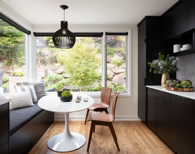
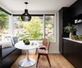
With a nine-year-old son and a dog, durability was another important consideration. “Betsey was concerned that nothing should be so precious that it would cause a compromise in their lifestyle,” says Alex. In the kitchen, Alex chose dark black stain for the custom wood cabinetry, providing a dramatic counterpoint to walls painted in Benjamin Moore ‘Simply White.’ Pental quartz countertops and lighttoned porcelain tile on the backsplash also lighten up the kitchen, heightening the contrast between dark cabinets and the verdant greenery of the yard. Every material was chosen for durability, down to the tough, wipeable finish on the cabinetry. There’s even a built-in dog feeding station to keep water dishes and kibble all in one place.
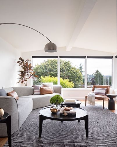
Though living room didn’t require any major architectural changes, White Space Design Group and the Matsubaras transformed it by selecting new furniture and completely reconfiguring the layout of the room. A large, curved sectional makes a statement, while a three-piece nesting coffee table lets the arrangement of the room flex to the Matsubaras’ needs. Alex says warm colors like brown were used sparingly throughout the home to maintain its crisp contrast. Natural materials like leather and wood gave the design team ways to bring in earth tones without going overboard.
“You don’t have to spend a lot on every piece for it to still look nice,” says Alex, recommending Rejuvenation, Blue Dot, and Room and Board for high-quality furniture at lower-than-designer prices. “We used a mix of slightly more expensive pieces, and some really economical pieces, plus reused some vintage pieces they already had.”
To soften the borders between inside and out, the team replaced two windows in the dining room with a set of French doors leading to the covered patio. “That gave us a five-foot unobstructed opening, with no center stile,” explains Alex. “During the summer, it was phenomenal to be able to have it all completely open,” says Betsey. “It’s helped us use the backyard patio so much more.”
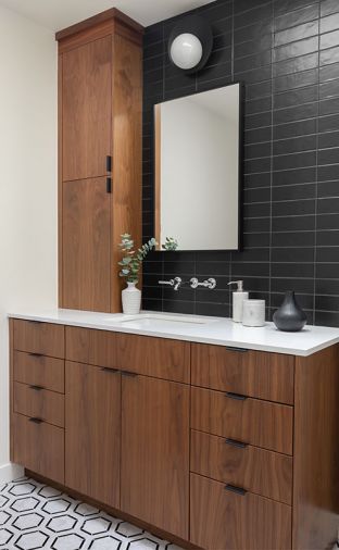
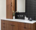
While solid colors dominate, Alex and Brooke incorporated several subtle patterns to bring interest into the spaces, including geometric tiles in the kitchen and bathroom and a patterned rug in the living room. Small areas like bathrooms are often a chance to showcase high-impact graphic motifs that might feel overwhelming in a larger room. In one bathroom, the team chose two different geometric tile patterns—one for the floor, and a different tile for a full-wall backsplash behind the sink. Chestnut-toned stain on the walnut cabinets bring warmth into the bathroom and help the cooler tones pop.
“We told Alex we wanted to incorporate graphic elements that were bold but understated, and she nailed it,” says Betsey. “I love how the tiles are unique and personal to our space, not something overused in other homes.”
Project complete, the Matsubaras say they couldn’t be happier with the decision to stay put instead of uprooting. “It’s so fantastic living here,” says Betsey. “I don’t even want to travel. I don’t want to leave my house. I’m just a total homebody now. It’s always been a joyful place, but now it’s just perfect.”
PROJECT SOURCES
CONTRACTOR
JLS Construction Inc.
www.jlsconstruction.com
INTERIOR DESIGN
White Space Design Group
www.wsdesigngroup.com
WINDOWS
Windows Doors & More
www.windowshowroom.com
PLUMBING FIXTURES
Grohe, Kohler; Appliances: Fisher & Paykel, Bosch, GE Microwave

